Circle
Rain Cosmetics England create beauty products with nothing to hide — pure, natural ingredients that treat skin honestly and gently, with no fillers, no shortcuts and nothing that shouldn't be there. They came to us with a product they believed in and a blank canvas: no name, no identity, no visual language. Everything needed to be built from scratch.
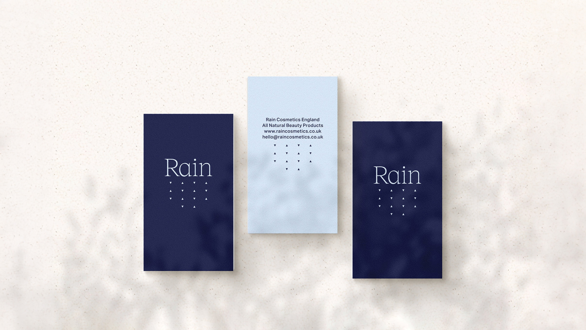
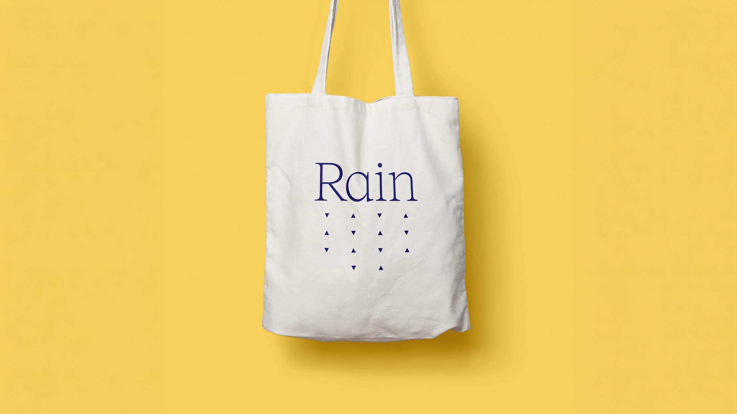
The project started where it needed to — with the name. Finding the right word for a brand rooted in nature and transparency isn't straightforward, but Rain felt immediately right: clean, vital, refreshing, and quietly honest. It captures something about the way the products work and what the company stands for, without trying too hard.
From there the identity followed naturally. Working independently across every element, the visual language was built to feel as considered as the products themselves — clean and confident, with an effortless freshness that carries across packaging, social and beyond.
It's rare to work with a company whose ethics run as deep as their product quality. Rain's commitment to genuinely clean ingredients made this a project worth doing properly — and that sense of integrity shaped every creative decision.
A complete brand built from the name up — rooted in nature, designed to last, and honest about what it is from the very first impression.
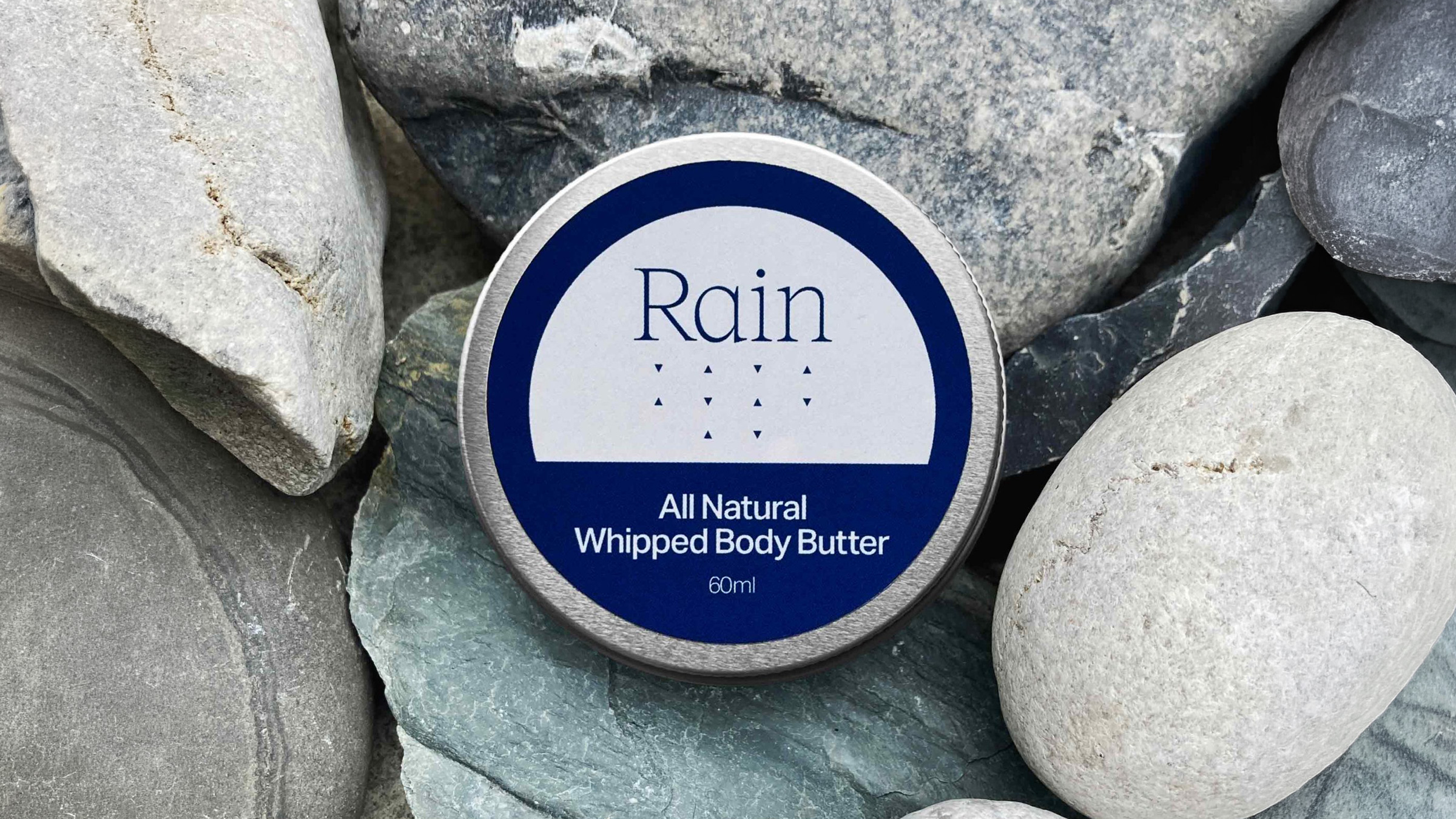
Brand identity and packaging.
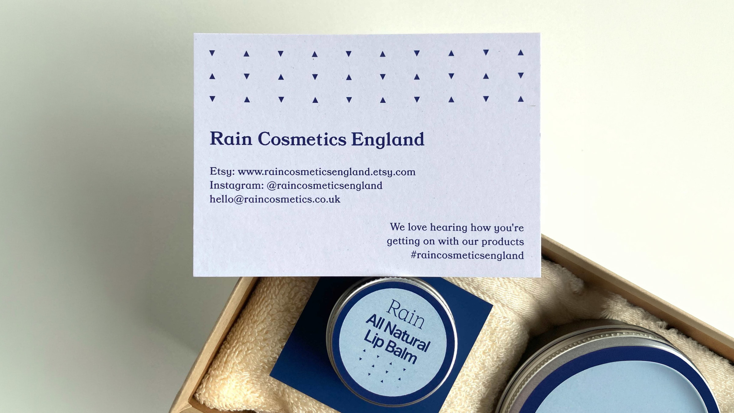
Brand identity in application.